6 Color Trends to Help Improve Your Mood in 2021

(Courtesy Family Features)
Now that many homes also double as offices, entertainment centers and even classrooms, the colors, sights and sounds you surround yourself with on a daily basis can play a critical role in fostering a positive mental space.
With the rise in external stressors correlating with an increased interest in mindfulness and self-care activities like yoga, meditation and aromatherapy, Valspar introduced its 2021 Colors of the Year with 12 livable shades that evoke calm, serenity and simplicity. Since a physical space can directly impact your mindset, this year’s colors have been selected to bring a sense of well-being to your walls, ultimately blending home improvement with self-improvement.
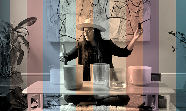
To help make the world of color a multi-sensory experience, the paint manufacturer partnered with author, sound therapist and meditation teacher Sara Auster to convert the colors into a soothing, calming and uplifting experience through “The Sound of Color.”
“This was a revolutionary idea for us, taking the signature colors we’re known for and creating a multi-sensory experience that goes much deeper than colors on a paint swatch,” said Sue Kim, Valspar color marketing manager. “We are very pleased with how this project turned out and think our customers will really enjoy interacting with our 2021 Colors of the Year on a whole new level.”
The range of cozy, comfortable shades provide flexibility and can be incorporated into existing design elements of your home. Consider these samplings and find the full on-trend palette at Valspar.com.
Optimistic
Yellow hues feel cheerful and can help elevate your mood. Optimistically warm, Soft Candlelight invites optimism and radiance with a golden glow that can light up any number of spaces.
Secure
Inspired by the protective qualities of natural stone, Granite Dust can help fortify your home against the worries lurking beyond the walls, creating a personal haven. The versatility of the color allows it to read warm or cool, providing flexibility to adapt to your decor.
Courageous
Vibrant and bold, Arizona Dust is a modern apricot shade that embraces tones from nature and helps bolster courage for whatever you’re facing next. Consider this playful hue in a satin sheen for added moisture resistance in spaces like bathrooms and mudrooms.
Sophisticated
Modernly classic like the beauty of white roses, Garden Flower is a soft, natural tint that captures a sense of sturdy growth and reliable sophistication to put both hosts’ and guests’ minds at ease. Black and white decor can help complement this shade that evokes clean growth on walls.
Confident
For the minimalists whose approachable elegance demands a space as effortlessly confident as they are, Gallery Grey inspires a soft confidence that is modern and natural. Bold architectural features can take center stage against warm gray walls.
Balanced
Subdued but inviting, the shadowy pastel of Dusty Lavender creates a soft but unexpectedly dynamic feel that is bright yet still soft. Carrying a shade such as this onto ceilings can give small rooms a larger appearance.
SOURCE:
Valspar
From entertaining, to creative uses for everyday household items, you’ll find a wide range of experts and guests with great suggestions.
